
Case Study
Phyllis Lucero Scholarship Logo
Overview
The Phyllis Lucero Scholarship is a memorial scholarship created in loving memory of Phyllis Estrella Lucero. Her daughter, Michelle, asked me to build the brand from the ground up, starting with the logo and finishing with a full set of brand guidelines she could hand to anyone who works on the scholarship in the future.
The goal was to create a mark that looks and feels like Phyllis. I worked with Michelle to learn about her and translated these stories into a brand identity that honors who she was while giving the scholarship a professional and lasting brand.
At a Glance
Type: Brand identity and logo design
Client: The Phyllis Lucero Scholarship
Role: Brand and logo design, completed solo
Timeline: One month
Tools: Adobe Illustrator and Indesign
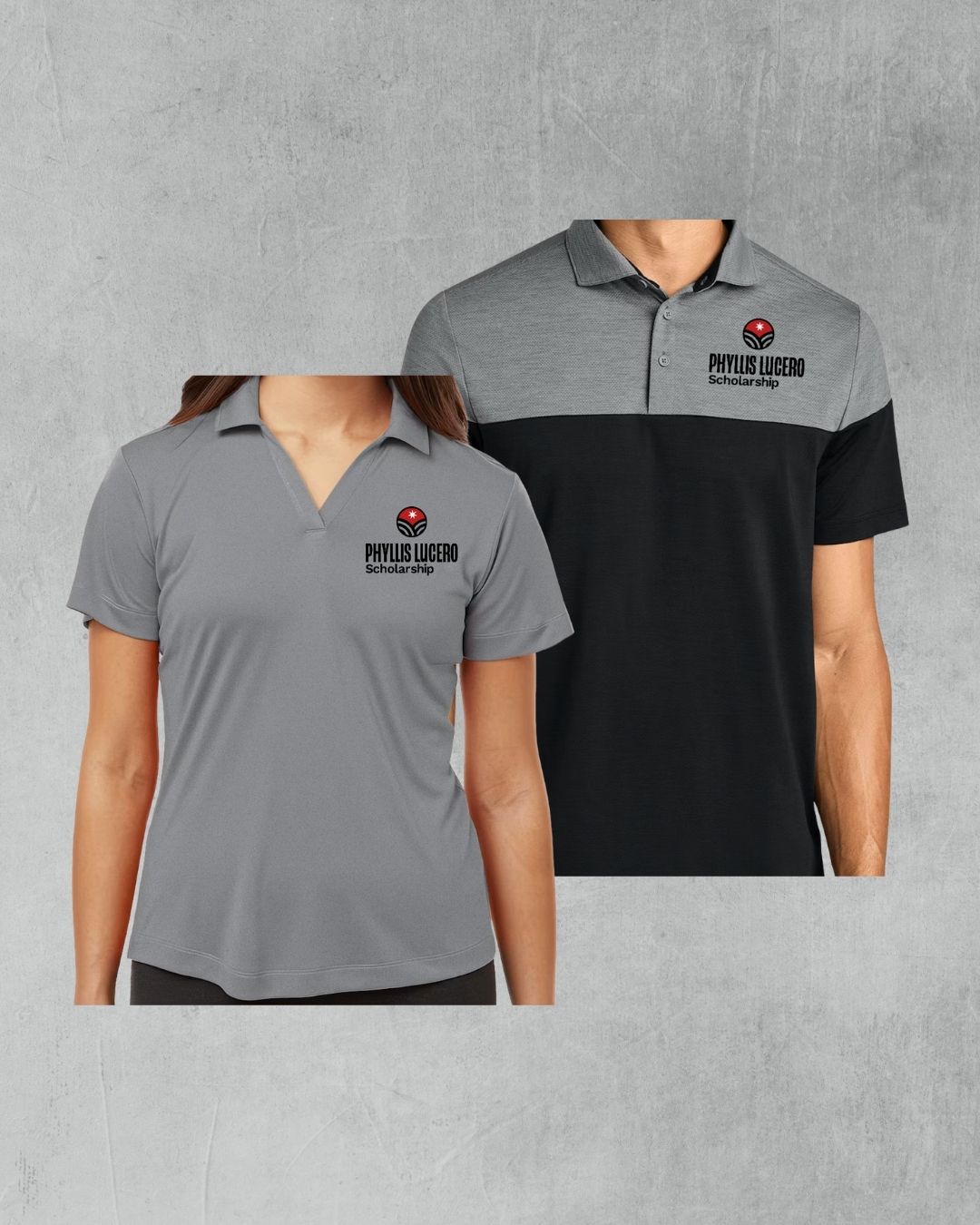
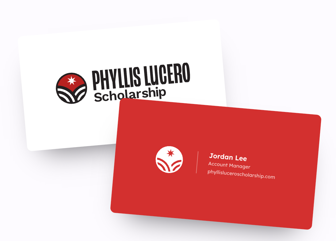
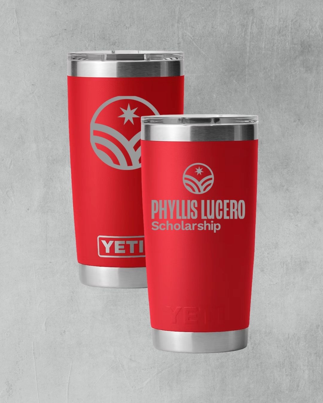
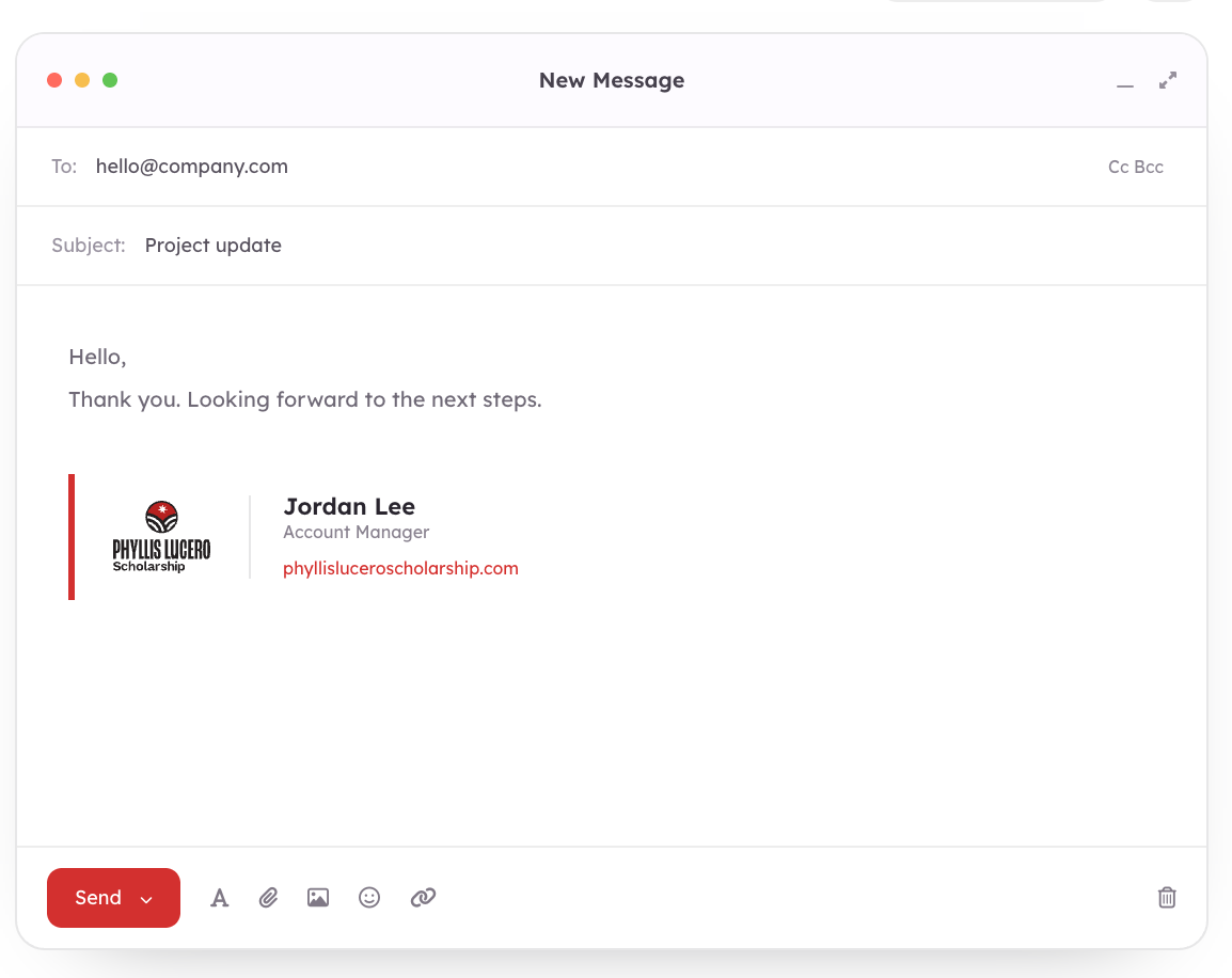
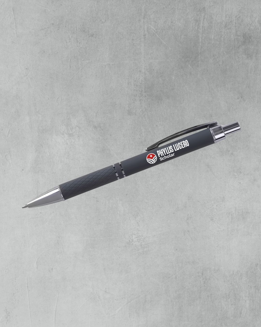
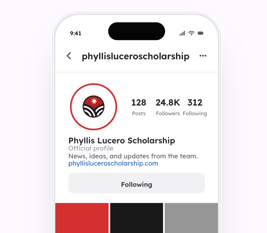
Deliverables: Logo suite, color palette, typography system, imagery and texture direction, product mockups, and a complete brand guidelines document
The Challenge
Phyllis was a specific person, not an idea. She was humble and giving, she loved the color red, and she raised her children close to the land, taking them out to pick chokecherries and piñon. The scholarship carries that spirit forward.
The challenge was to hold two things at once. The brand needed to feel bold enough to stand on its own and be worn with pride, and humble enough to stay true to a woman who never asked for attention. It also needed to work in the real world, from a small embroidered logo on a shirt to a printed program, without losing its meaning.
The Approach
I built the identity around the details that mattered most to Phyllis' family.
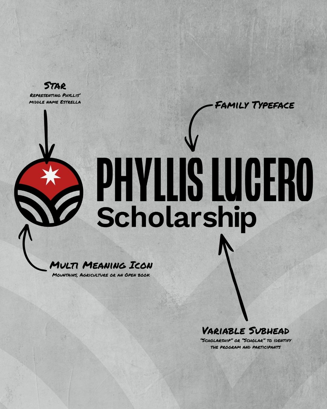
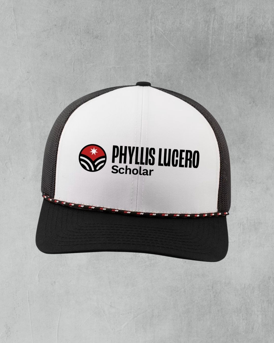
The star comes from her middle name, Estrella, the Spanish word for star. The mountains reference the land she loved and read as an open book for the scholarship itself.
Red leads the palette because it was her favorite color, supported by a warm neutral palette and a small secondary set drawn from Colorado's landscape. The type pairs a clean, sturdy sans for everyday use with a warm serif reserved for Phyllis's name and the personal moments in the brand. A supporting kit of imagery and textures, including a rounded wave, star points, and soft washes, gives the scholarship room to grow without competing with the mark.
The Results
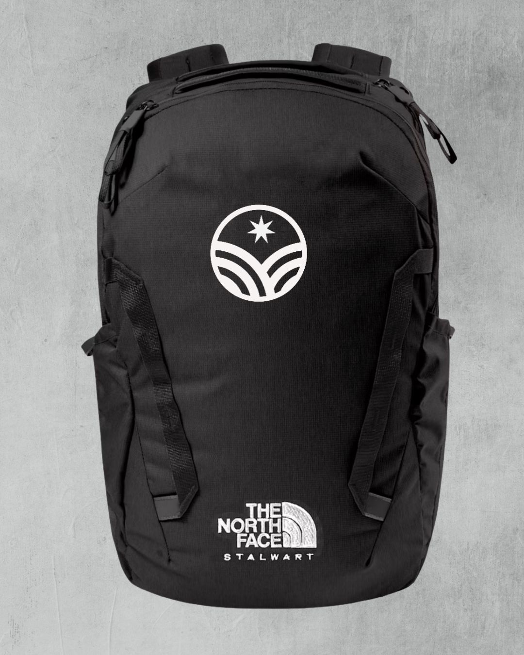
Rather than a single logo, I delivered a full family of lockups and treatments. There is a primary program logo, a scholar logo, stacked and icon-only versions for tight spaces, and one-color and reversed options for every background the scholarship might use.
"When I tell you how amazing Dylan is… I am sure it is an understatement…. He “got” my mom & her essence …. And how the scholar experience will evolve…. All encapsulated in the inaugural branding! THANK YOU!!"
Phyllis' Daughter
humble, proud, and personal.
Looking for A BRAND THAT MEANS SOMETHING?
Prepared By
Dylan Lindsey LLC
Get In Touch
info@dylanlindsey.com